Summary of Ten
January 15, 2009
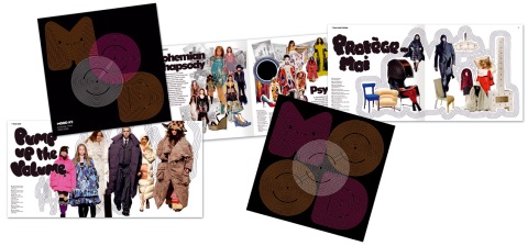
Neon magazine has been a labour of love for me. It has given me the opportunity to research two of my favourite things, design and sci-fi. The decision to explore science fiction was first born out of the choice of title for the magazine. The name that was given for the project was ‘Ten’ and I instantly decided that I was going to use a different name from the obvious. I researched and discovered that in the periodic table the number ten is Neon. As soon as I heard the name so many thoughts and images came to mind, which made it a good starting point for me as I looked for the ten items needed to fill the magazine. The books I would later find in Bristol Market would decide the theme.
When arriving at St Nicholas Market in Bristol I found a bookstore that sold 1950’s Science Fiction books. The style of these and the title I’d earlier chosen seemed to fit perfectly together. I could already imagine the finished product that would explore the ideas these writers had about how the world might be in the 21st century. What if some of the crazier ideas they thought of had come true? What if technology had accelerated as fast as they thought it might do? This was also a way of injecting the project with humour, which was something else I wanted to do with it. On the same day there was also a store that sold old stamps. I brought a collection of Soviet Space stamps because they had both the modern and futuristic look that would keep my designs current, whilst capturing the excitement and possibility of the time they where made in.
For the look and feel of the magazine I took inspiration from both new and older designs. I liked the idea of using both together as it reflected the old ideas from the 50’s presented in today’s environment. I had by now finalized what my ten items were going to be and wanted to put as many of them actually in the magazine as possible for the reader to touch. I felt this would create a sense of reality to what I was doing. I wanted them to be everyday items, the more mundane the better. The products, which included stamps, calling cards and a bible, allowed me to create a future that was similar to life as we know it but more technologically advanced than us, that travelling through space was not a boundary anymore. I wanted this future to feel a little like watching an episode of ‘The Jetsons’ and just as the writers of that show did, create futuristic items that resemble those we already have.
In my mind the thing that really tied all my ideas together was my logo. It even inspired me to create my on font. It had the balance of old and new and really gave my magazine its identity. As much as I loved the retro road I was going down, I didn’t want my work to feel old to the reader so I used CMYK colour in the designs from very early on in the development stages and right though to the finished article.
Once I had made design decisions about the magazine and what the products were going to be, I started thinking about the presentation of the magazine. I thought it would be a good idea to make a case to protect it all and increase it’s feel of worth to the reader.. My first choice for the case was Aluminium, as it seems to be linked, at least in my head, with space and the future. The final decision in this whole process was finalizing with the printers. Stock and binding was very appealing to me, if not more so that the choices of what colours and sizes to pick. Choosing the right stock would make or break a magazine. I went with a 300gsm cover with 150gsm stock for the content.
Through out this whole process I have tried to push ideas, and explore many different ways to create the effect I was looking for from the cartoon beginnings right the way through to the futurist magazine that has gone to print.
everyoneforever [DOT] net
January 14, 2009

an expanding report of exploratory thinking and doing from the edges of every discipline;
from Aerobics to Zoology and everythingin-between
brandspankingnew [DOT] net
January 14, 2009

They have a collection of Interesting Design that they have been collating back as far as May 2005.
It’s Nice That [Dot] Com
January 14, 2009

It’s Nice That was launched in April 2007 by designers Will Hudson and Jez Burrows to document and inspire creative talent.
sylvia tournerie
January 6, 2009

She is doing some cool work, looks awesome.
Sleeveface
January 5, 2009
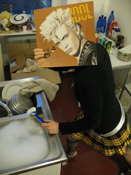
Just after creating a project with Tom Morris, where we got Hundreds of people to draw themself a new face, hold it in front of their own and let us take a picture of them. I spoke with a gentleman at an exhibition who informed me of a similar idea but with record sleeves, called Sleeveface. Here are a few for you.


Patrick Leger
January 3, 2009

This guy captures an old style, a style im into right now.
Browzing the net and stumbled over this…
December 29, 2008

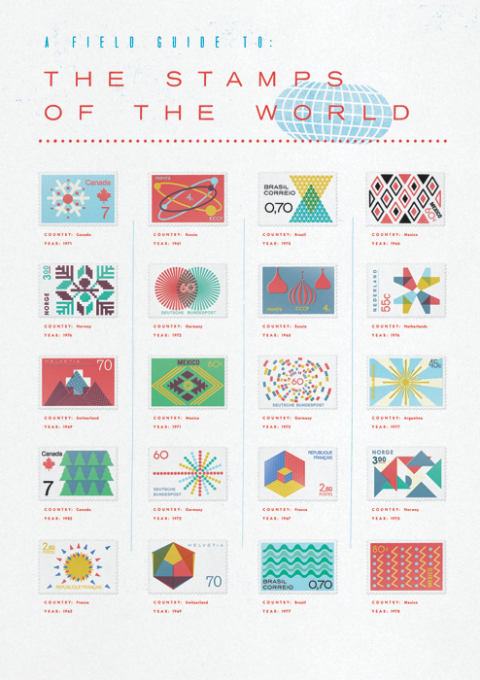
What a beauitifuly designed piece. mmmmm, very nice.
USSR Posters
December 23, 2008


Ben Wilkerson Tousley
December 20, 2008

I love this poster that was designed for the John Waldron Arts Center. I love the use of colour against the black.